
Coding agents provide lightning fast data visualization tools
I'm not talking about yolo-ing private info, I am talking about how coding agents are ideal for quickly generating data visualizations, check out my examples below

In this completely wild interview Peter Thiel talks about his views on stagnation and how science and society in general is not progressing forward. He says that in some ways specialization has made it so that moon shot projects are not happening, but also, moon shot projects are simply not happening. He makes some sense about this in my opinion. Specialization in science makes it such that a collection of peer reviewers (typically 3) can no longer adequately review papers because a paper includes too many different topics. For example, you might want someone with a background in AI that includes LLMs and computer vision, someone with a background in geochemistry, and someone with a background in geophysics to review this paper I wrote about a data pipeline for ingesting multi-modal borehole data. But just asking for adequate reviewers for the AI section is perhaps a tall order when there are 100 AI/ML papers posted on Arxiv a day.
Interactive data visualization is a a key skill that has, for a long time, been locked up by front end web development tools (d3.js for example) that most scientists get no exposure to during their PhD training.
All the same can be said about producing modern, interactive data visualizations. Modern data visualizations like this one from the New York Times about economic yields, this bellingcat map of number of Ukrainian civilian deaths in the war in Ukraine, or this zona.media map of the number of Russian deaths in Ukraine all present striking visuals to communicate understanding from data. Interactive data visualization is a key skill that has, for a long time, been locked up by front end web development tools (d3.js for example) that most scientists get no exposure to during their PhD training. Moreover, most data visualization can be an enormous time sink for scientists who build such visualizations in order to communicate with others their results. However, coding agent tools like Claude Code are changing this. Below I detail a few examples that I have vibe coded in an afternoon (or less!) that show off these capabilities. I include a link to each one and also the approximate amount of time it took me to get from 0 to something on each project.
Gaining an intuition on L2 regularization
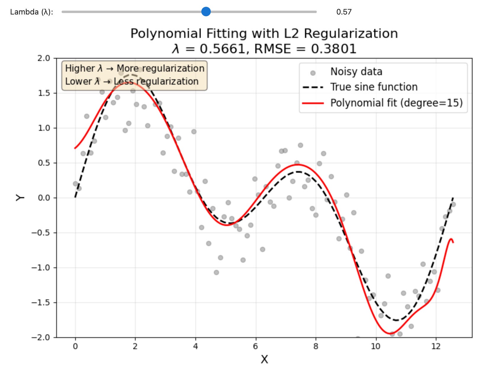
Regularization is a common machine learning tool to control model overfitting. Most models are good at “overfitting” data which means they learn all the details of a data set at the expense of the big picture. Regularization fixes this by changing the way models learn to fit data by challenging the assumptions the model is making at each learning step. This is true whether the model is a linear regression, a gradient boosted machine, or a neural network. To test this out I wanted to build a nonlinear data set that could be fit well with a model using a regularization term. In this case I focsed on the L2 regularization becuase its very common across AI/ML but there are a lot of options. I created some noisy sinusoidal data, then fit it with a polynomial that includes a regularization term. The strength of the regularization is always controlled by a scaling variable called the “learning rate” which in this case is represented by λ. By sliding the λ slider back and forth we can control how strongly the L2 regularization term affects the model.
Total time to make the notebook: 5 minutes, then I edited the code and played around with the notebook for about an hour.
You can find the code here if you want to play around with this visualization: github.com/mnky9800n/l2_regularization
Comparing the population of US counties that are the same as major cities around the globe
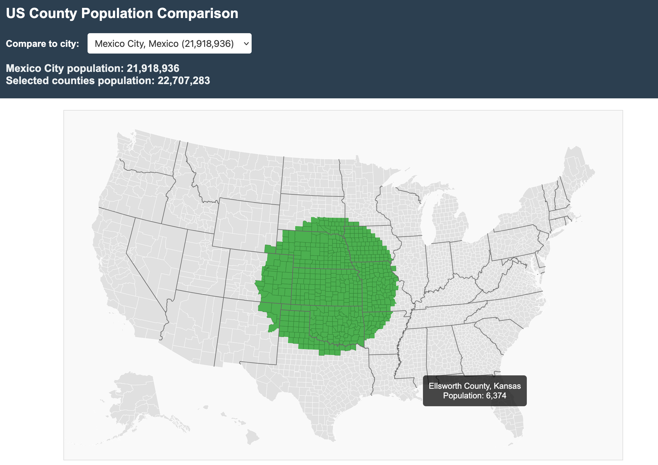
There are lots of political discussions to be had about the distribution of votes in the US House of Representatives, but one thing is for certain, Americans are concentrated in cities and there are many counties that have very small populations compared to any region close to a major metropolitan area. I came up with this idea based on Derek Camp’s LinkedIn post which showed a static map. I posted a comment at the time saying:
Then I thought to myself, well, why bother posting such a comment if you are unwilling to at least try to make the visualization yourself! So I started up Claude Code and got to work. In about half an hour I had made this visualization tool I uncreatively called “popviz” which allows you to pick various cities and then it automatically highlights the counties based on where your mouse cursor is.
Time to make the visualization: 30 minutes, maybe an hour max, It had some bugs in the first iteration on highlighting the counties that needed to be fixed, but thats it.
You can find the visualization here: https://mnky9800n.github.io/popviz/
You can find the code here: https://github.com/mnky9800n/popviz
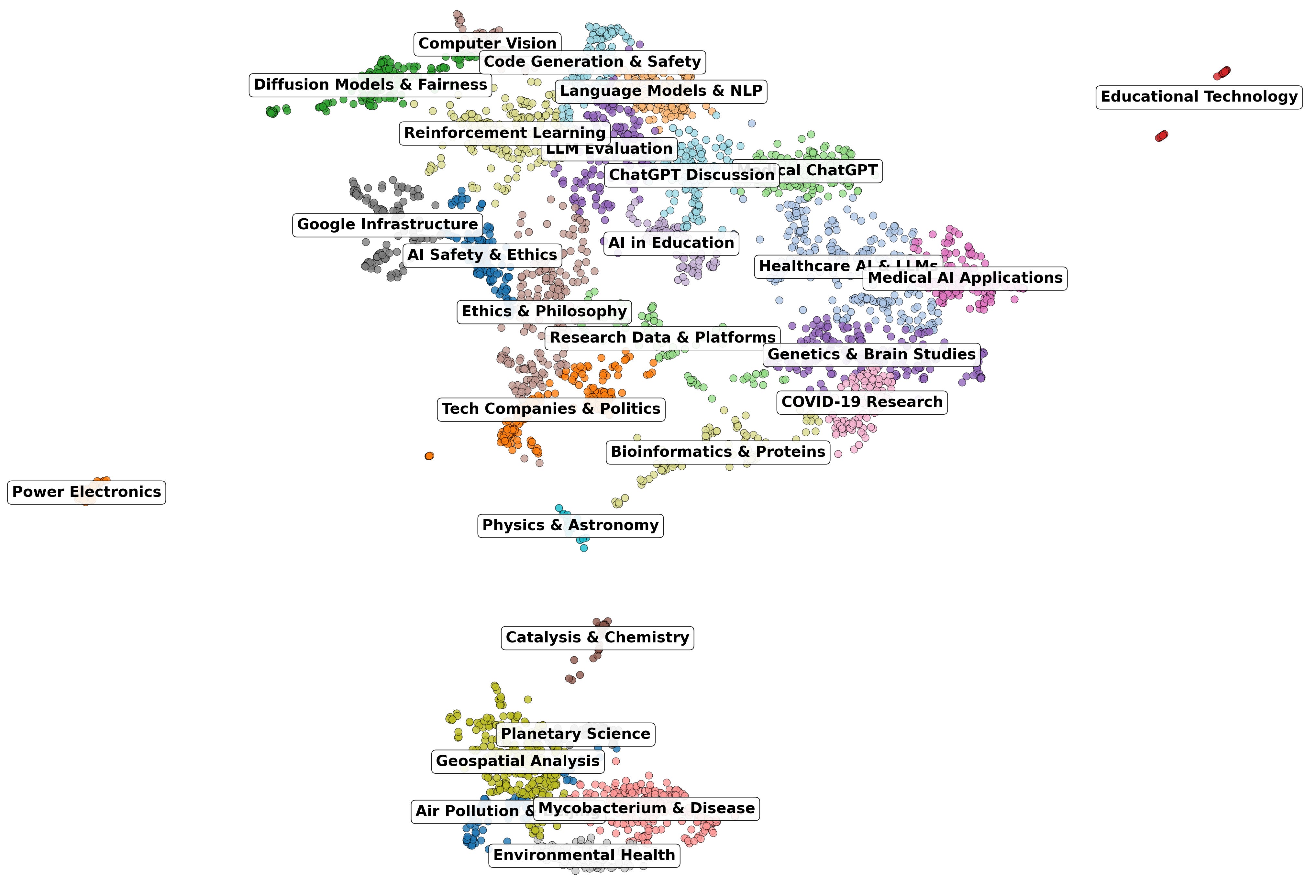
Investigating the topics of papers published at major AI research labs
The center of gravity in scientific research may be shifting away, in some ways, from universities and public institutions toward private labs powered by AI and often backed by venture capital. But how do we know? First I identified the top 10 AI labs that I wanted to investigate. Then I asked perplexity to research how much money they had raised and produce a big table for this. Then, using this table of various AI labs, I had Claude Code generate a list of topics from the labs, key authors that had worked at these labs, and a query script to pull a subset of papers from the semantic scholar API. This included a list of the paper titles, authors, and SPECTER2 embeddings (a document embeddings model specifically designed for academic papers). These were then put into a Gaussian Mixture Model that could cluster the topics, to eventually produce this plot, all the papers transformed to UMAP space, labeled with their topics. This is all further discussed in the post below. However, if you are at all interested in doing some kind of library science (i.e., figuring out ways to automatically gain insights from large bodies of scientific literature), I would suggest starting with the semantic scholar API. You don’t even need an API key to get started!

Time to produce: an afternoon of going back and forth from writing the substack piece and working on the analysis codes.
Calculating earthquake statistics for California while giving a presentation!

About a month ago I visited the University of Texas at Austin, Institute for Geophysics after having been granted the award from their visiting fellowship program. This is a great program and I strongly recommend reaching out to someone at UTIG if you find their work interesting and want to work on something together. When I got the award Thorsten Becker, geophysics professor, computational scientist, and all around cool dude asked me to give a talk on “AI tools”. He didn’t provide me any other guidance. Ha! So I decided that I would give a talk on three different topics. First, my thoughts about how the computer is a tool that lets you model anything you can imagine and that is how we should interact with any new computational tool. These ideas all came from watching talks and lectures by Steve Jobs, Wil Wright (creator of Sim City 2000), and Jensen Huang, amongst others. Second, I spent some time talking about using tutorial driven software development to build better computational tools for science. A core focus on tutorial driven software development is that it places documentation as a primary component of the software development process. This also makes it very accessible and discoverable to AI models. This is something that we had used on the 4D-Modeller project and the merrypopins project.

Lastly, I summarized the results of the substack I described before, that AI labs have pushed a lot of science in the direction of using AI to do science, and a lot of that cutting edge science happens there.
After a short introduction to my ideas, I told the audience I would open up Claude Code (see me describing this in the picture above) and using the following prompt, allow it to run in the background while I continued my talk.
Prompt: Download the ANSS earthquake catalog for California from the last 20 years (minimum magnitude 2.5), then write a Python script to calculate the Gutenberg-Richter b-value and create a matlotlib plot showing the magnitude distribution with a fit line. If you have used Claude Code before you know that sometimes it will think for a minute or two before it asks you for interaction again. So this was perfect to get back to giving my talk while Claude did his thing. And so as Claude would ask for interaction I would switch back and forth until eventually voila:
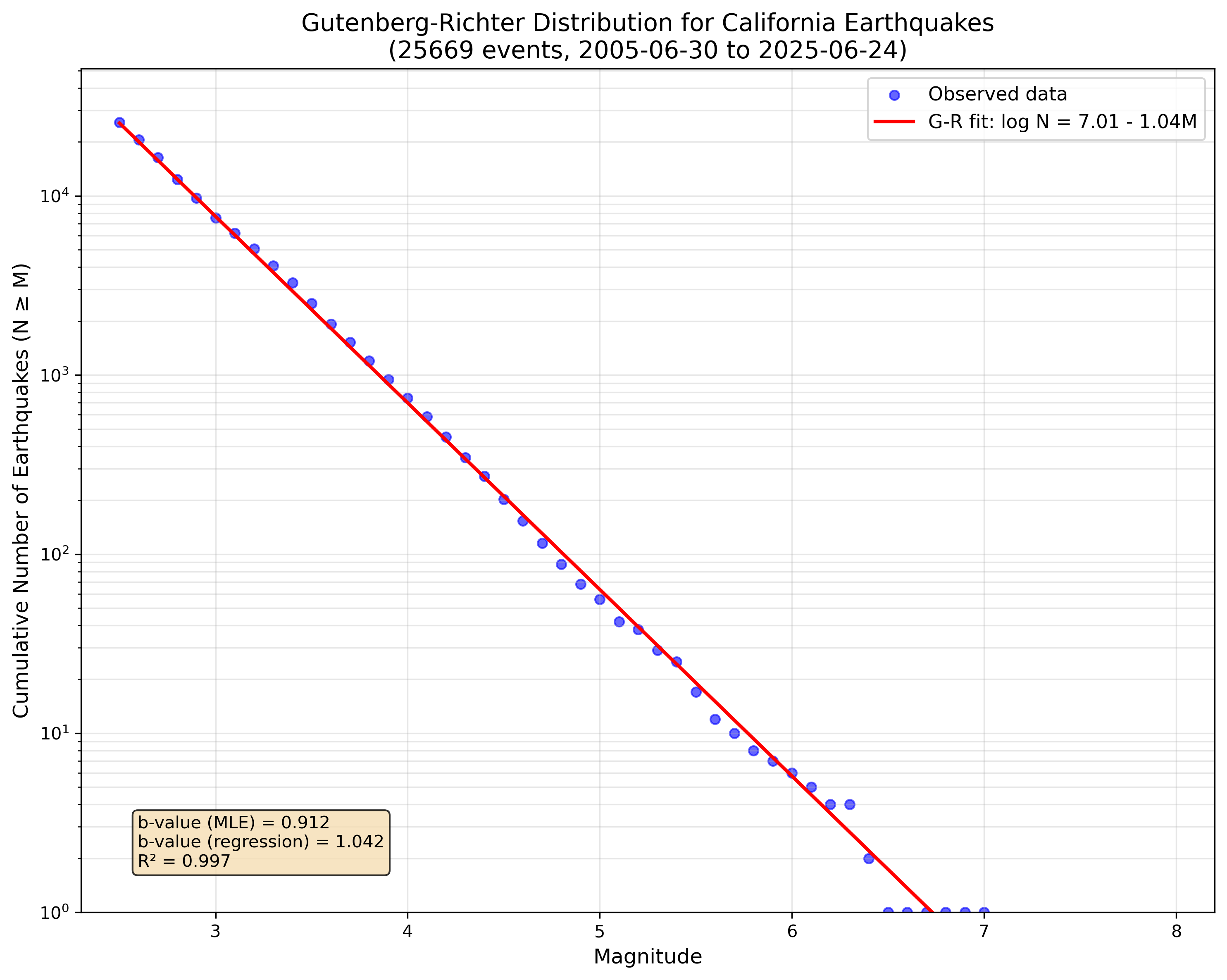
The matplotlib interactive plot environment sprung to life on top of my slide producing the above plot. Almost like magic I had multiple b-values, data, plots, and everything a statistical seismologist could ever want. Of course the point of this exercise was not to perform some act of science, but to show that I could casually, without much effort, produce a common analysis that most of the people in the room would have some familiarity with as to how much effort it would take and what considerations needed to be made to do the analysis. That is to say, they could immediately examine the plot and decide if it was BS or not and what changes we could make to enhance the work.
Time to finish: 5 minutes of talk time, I would switch to Claude Code any time it popped up to say it wanted some feedback.
The future is here
I think that one thing that is really cool is just how fast all these examples were able to be prototyped. Mostly I had something working in less than 30 minutes. Only the substack post about AI labs took longer, and that was because I performed a more complex set of activities compared to the other examples. Are there mistakes in the code? Probably. Are there mistakes in the code if I would have written it myself? Definitely (lol!). The strength here is that Claude Code, and other AI coding tools, allows you to go through more iterations of an idea but also to try out more ideas. Of course, if I was going to use any of these codes for a paper or a production environment, I would put them through much more scrutiny than I have here. My point in all this is that a lot of the sort of “boiler plate” data analysis and visualization that scientists may be comfortable doing in an afternoon now only takes half an hour. And even further, that many of the interactive data visualizations that were before only doable if you know more about front end web development are now immediately available to all scientists. And that is a good thing.
